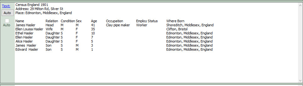
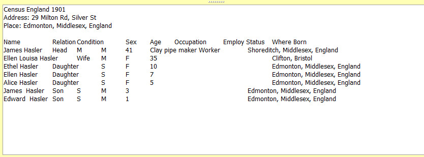
Although I've edited my automatically generated text to line up in AS, I generally need to re-edit in FH7. Examples below show the text in AS and then the text after it's arrived in FH7
I'm not using Rich Text Support.
What settings are needed in AS to ensure lines up in FH7 without needing to be re-edited?
thanks
* AS Font query
- NickWalker
- Megastar
- Posts: 2608
- Joined: 02 Jan 2004 17:39
- Family Historian: V7
- Location: Lancashire, UK
- Contact:
Re: AS Font query
The simplest answer is that it isn't really possible - this is why the FH rich text feature was my number 1 'wish list' request for 15 years.
However, you may be able to get acceptable results as long as you consistently use the same font and font size in AS and FH (including reports). See this article on the FHUG knowledge base for details: https://fhug.org.uk/kb/kb-article/tabul ... d-reports/ - this was written several years ago before AS supported rich text and also refers to FH6 settings but you should be able to work out how to apply these settings.
-
- Diamond
- Posts: 99
- Joined: 12 Mar 2016 22:50
- Family Historian: V7
- Location: Dorset, England
Re: AS Font query
Nick, thank you very much for clarifying.
- jimlad68
- Megastar
- Posts: 921
- Joined: 18 May 2014 21:01
- Family Historian: V7
- Location: Sheffield, Yorkshire, UK (but from Lancashire)
- Contact:
Re: AS Font query
I use a Monospaced font for anything that needs column lining up without tabs.
(Consolas is my current favourite as it looks reasonable and quite portable).
I still don't, and probably will not, use the new FHv7 Rich Text, and I note
"I'm not using Rich Text Support," so a monospaced font might work for you.
The only problem is that within the FH program you set Fonts in properties > property box and it is the same everywhere, whereas a proportional font can be easier on the eye when not tabulated.
For reports there is an option under Format for section data, as this is mostly where any tabulated data is (e.g. Text from Source) I set this for Consolas.
With AS, I usually just accept what AS gives me with a column separator, then balance the columns with a macro in notepad++ or word, but you can also use consolas in AS.
[edit] This is an age old portability problem, well documented in Nick's link. Most websites (e.g. Ancestry, Geneanet) give you 1 font and most websites delete all multiple spaces to leave 1. For these instances, if I have time, I find if I add a few _ (underscores) instead of blanks, with columns separated by " |" (blank bar blank) it gives a better semblance of columns.
Jim Orrell - researching: see - but probably out of date https://gw.geneanet.org/jimlad68
Re: AS Font query
Thank you for your answers to this question. I was going to ask the same question on alignment